Maureen Golgata: The Abstractionist
“Everything begins with intent,” Naples painter Maureen Golgata says. Her works starts with a moment—a poignant conversation with a stranger, a pivotal life transition. After rigorous training in classical methods (Maureen studied under a leading exponent of the Boston School movement, which blends the color palette and light theories seen in French Impressionism with traditional portraiture and a keen focus on technical skill and detail), she explored new methods of creation at the Fashion Institute of Technology. There, the budding artist absorbed the vibrant colors of New York City. “Everyone dressed in the most magnificent outfits—the color combinations they would put together, it was inspirational,” Maureen says. The Massachusetts native now channels her emotions, spurred by chance encounters, human connection and the natural world, into dreamy abstract paintings imbued with color and life.
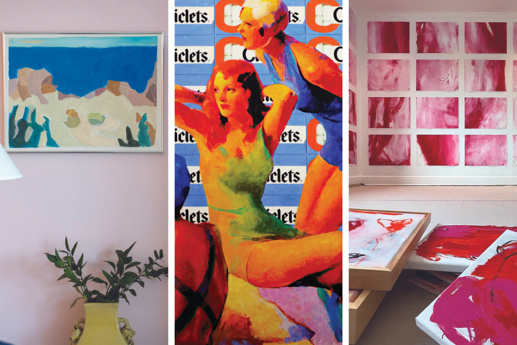
Her saturated palettes evoke colors found in nature, like the thrumming, International Klein Blue-esque hue (the shade mixed by experimental artist Yves Klein in the ’40s and found in the Gulf’s subtropical waters) or a sage-like shade of pale green. Her hand moves the brush acrobatically, often combining white and one other pigment so that the two colors are mixed directly onto the canvas. Each pigment serenely blends and dances around the other without becoming overwhelming. Her abstractions are ethereal, like a dense fog or steam. “When you’re in your studio, it’s all memory, feelings. You’re delving into lived experiences,” she says. The abstract artist’s work departs from her realism training, but the fundamental tenets of form, composition and color underpin each painting.
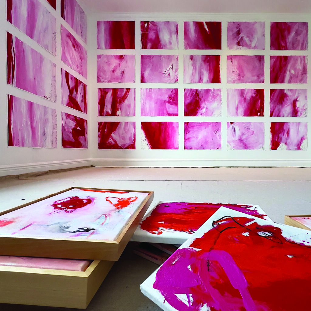
Maureen often marks rites of passage with art. After her mother passed away in 2022, she created a suite of small, white-and-crimson abstract paintings that hang in a row in her home. “They’re about metamorphosis, impermanence,” she says. The deep crimson pigment reflects echoes of her mother’s heartbeat. As Maureen worked through the series and processed her grief, the visceral red lines of the first panels blended into soft, magenta hues. “When you work on a piece like that, there is a knowing of yourself at the end,” she says. “You discover who you are.”
Anita Putnam: The Fauvist
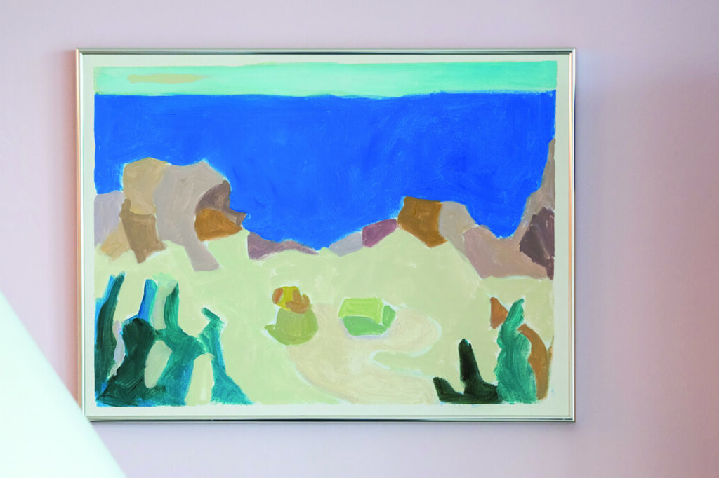
Anita Putnam recalls growing up in rural Connecticut, surrounded by homes cast in dark, looming hues. “But my mother had a fantastic color sensibility,” she says. The painter, who now lives in the Shell Point community of Fort Myers, grew up in a house awash in mint green and lavender, and she carries the affinity for chroma into her current home, with its Easter yellow front door and pink-walled art studio. Anita doesn’t just use color as a key element in her cheerful paintings. Instead, color is part of her life, incorporated zestfully into her decor and wardrobe. The affinity comes through as a muse in her pieces. “When a painting is really going to work, it sort of paints itself,” she says. The artist sits down with a vast assortment of colors in her palette, ready for any to reveal themselves as essential. “It comes to my mind what colors I should use, what’s going to work there,” Anita adds. “I just hope to get into a flow where it seems to be painting itself, and I’m the instrument.”
Her paintings, done mostly in acrylic, start as loosely drawn blue silhouettes on stark white canvases. There may have been a reason for using the color blue at some point, but she has long forgotten the motive. Now, it’s more of a superstition—if she doesn’t start with blue, she swears it doesn’t come out right.
Anita paints rapidly (“like I’m plugged into a socket”), not covering the canvas entirely but populating the surface with a mosaic of glowing color. The mosaics comprise elbows, floors, dogs and sparse abstract shapes; the images are flat, graphic and painstakingly arranged. Her work recalls Matisse’s paper cut-outs of vegetal and abstract patterns or the sun-washed compositions of the painter’s hero, British contemporary art legend David Hockney.
After attending art school for a few years in Boston, Anita painted sporadically through her early adult life while balancing a decades-long career as a V.P. at a life insurance company and raising six step-children. She began painting full-time after retiring to Sanibel in 1992. Now, the artist channels her love of vibrant hues into her artwork. “My husband, when he first met me, noticed all the color in my home,” she says. “Now, he’s surrounded by the color in my artwork, too.”
Holly Manneck: The Pop Artist
“The places I’ve lived have always had really brilliant colors—the mountains of New Hampshire and Vermont, the Caribbean, and of course, you have brilliant blues in the water in Florida,” Naples Art District artist Holly Manneck says. Her contemporary pop art blends and layers colorful photography, digital art, oil and acrylic paints, and screenprinting into pieces that are arresting and playful.
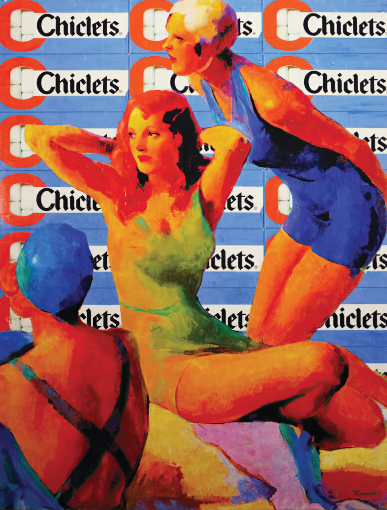
Though her work seems to recall Andy Warhol’s, her approach—collaging images and layering them with different media—is more akin to contemporary juggernaut (and famed Captiva Island resident) the late Robert Rauschenberg. Wry scenes play out in her compositions, from cowboys strolling through technicolor landscapes to sunbathers lounging amongst old candy logos.
Holly uses color as a tool to make her pop art pop, with conspicuous and vivid imagery that often represents women who embody strength, resilience and beauty—traits inspired by her single mother.
The super-saturated, Florida-derived colors pull viewers into her work, helping drive home their feminist message. Her vibrant palette draws from the world around her. “Naples doesn’t have moody, atmospheric color,” the former graphic designer says. “When I mix my colors, I try to achieve certain colors that I envision working together on the canvas—one color will influence the others, and I adjust everything accordingly.”
