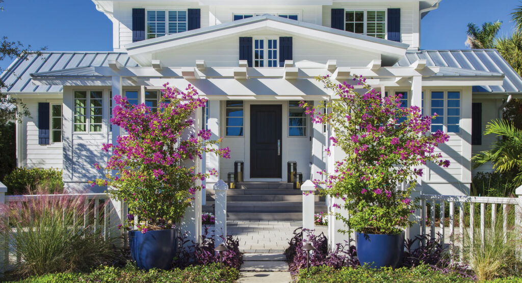
From the front, a renovated 1940s-era cottage on Naples’ Broad Avenue South is Old Florida, beach-town chic. It is charming and modest, with a facade decorated with a gabled porch and a low-sloped roofline. But inside, it’s styled like a big-city apartment, all clean lines and subtle luxury. “Naples is changing,” Hudson Park Interior Design founder L.A. DeRiggi says about the influx of international and big-city settlers. “The vision was to marry the Old Florida charm with a more modern, metropolitan feel.”
MHK Architecture led the renovation to bring the home to the present day. As a first step, the MHK team lifted and rotated the original house to make the facade parallel to the street. That meant the group could make better use of the home’s deep lot, adding a second floor and nearly doubling the square footage without changing the street view much. “Most people are looking for a much larger home than they were 80 years ago,” Anna Moore, the MHK architect who led the project, says.
The team was tasked with expanding the home without compromising the historic facade. “By keeping the front elevation the same, we were able to expand the footprint without making it look like some giant new construction,” Anna says. MHK built out window-lined rooms on either side of the front door and added an entry porch “out proud” of the house. “It’s a little more inviting; it’s sort of welcoming you in,” Anna says. Stones lead from the sidewalk to a trellis and a gate (“It’s a nice division from the sidewalk and a cute little element that offers a little privacy,” she adds.), while a new U-shaped driveway makes it easier to drive in and out. MHK also extended off the back to add more indoor-outdoor living space, a pool and hot tub, and a garage for three cars and a golf cart.
Inside, L.A. DeRiggi bridged contemporary sensibilities with traditional elements. Kelly Wearstler dark bronze sconces anchor a floral painting by Naples’ Carmelo Blandino and welcome you into the open floor plan. Being keen on materials and their interactions, L.A. DeRiggi played with the sophisticated finishes throughout. In the living room, marble with grooved fluting surrounds the fireplace and TV. “I worried that a single, smooth piece of marble would feel cold,” he says, adding that the treatment softens the marble and adds movement.
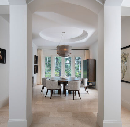
Elsewhere in the home, clean-lined cabinetry contrasts the tongue-and-groove ceilings, exposed wooden beams and natural stones commonly found in older homes. “Natural materials were the driving force of the project,” L.A. DeRiggi. says. Mosaic tiles, herringbone-patterned floors and the ironwork on the stair railing offer an homage to the craftsmanship of the early 20th century. “These details are a nod to the artisans and tradespeople who were building houses at the time,” he adds.
Inside and out, the home is a study in contrasts. Outside, the sun’s light and shadow highlight architectural features, like deep eaves, and large brackets and corbels. Inside, L.A. used a palette of black, white and wood tones to give each room personality. “Dark colors and contrast make sure a space doesn’t feel sterile or stark,” he says.
From any interior vantage point, you see how all the elements work together. The floor in the entryway is a mosaic by Mosaïque Surface, with antiqued Calacatta Oro, Dinasty Mist and Nero Marquina marbles. On the ceiling, cypress panels—a classic choice for Florida—are paired with contemporary lighting with modern right angles and softer alabaster disks to diffuse light. “I was very focused on how things connect and how materials play off each other—we wanted to create a feeling of cohesiveness and serenity,” L.A. DeRiggi says. “That’s how I approach all my spaces—even when they’re empty, I want them to feel complete.”
Just beyond, MHK made the stairwell a focal point, dividing the entry from the great room. The clients wanted a floating staircase with a glass railing, and L.A. compromised, keeping the floating aesthetic but using iron for the gently curved railings that connect to the home’s traditional roots.
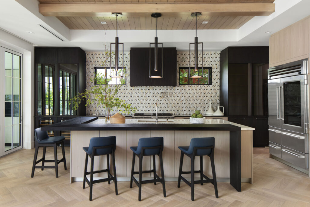
Similarly, in the kitchen, L.A. mixed trend-forward and tried-and-true elements. A variety of wood finishes and stains showcase a striking example of tonality done right. White oak flooring and Poliform cabinets from Naples’ Richlin International and a white Classic Venato Marble island cast a dramatic foreground to the black-stained elm surround. The cypress tongue-and-groove ceiling, fabricated by Naples’ Floridian Carpentry, and marble-and-limestone mosaic backsplash tie the darker and lighter finishes together. “[The backsplash] brings movement into clean lines,” he says.
The bathrooms show off how the designer played with the cohesive color and material palette to distinct effects. For the primary bath, L.A. installed his-and-hers vanities with a tub and shower between the two. “Especially post-pandemic, there’s been a focus on incorporating elements of spas and retreats into our homes,” the designer says. A basketweave marble backsplash adds texture and depth, and ceiling-hung mirrors make the room seem taller. “When things are suspended from the ceiling, it enhances the feeling that there’s something special about the room,” the designer says.
While the primary bath got polished marble, the en-suite bath for the VIP guest room (located on the newly created second floor along with two other bedrooms and two lounge areas) was outfitted with honed marble and curvilinear marble tiles that “are kind of organic, kind of retro—white but still warm,” L.A. says. The second-floor guest bath blends Arabescato marble with a black geometric mosaic tile on the wall, and the downstairs powder room extends the use of the stone, covering the walls and vanity with Statuarietto Monet marble with black and blue veiling. In every bath, cleverly hung fixtures make the rooms appear larger as they reflect light. “I love hanging pendants over mirrors to play with the reflections,” L.A. DeRiggi says.
Taken together, the home kept its historic charm but now fits cosmopolitan tastes. “Naples is still a coastal town, and we wanted to reflect that lifestyle, but we added a level of sophistication to the design,” L.A. DeRiggi says.
Interior Designer: L.A. DeRiggi
Architect: MHK Architecture
Photography: Lori Hamilton

