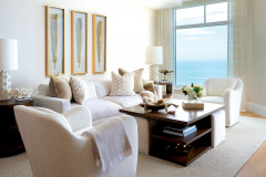
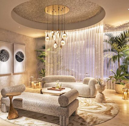
Stepping inside this Marco Island apartment, you’re prompted to take a deep, cleansing breath. Inhale, a space done in subtle variants of cream with every detail conceived to exalt the Gulf views—exhale, the worries of the day. A generous Burton James sofa covered in performance fabric beckons family and guests to enjoy the view of the Ten Thousand Islands in the living room. “We wanted your eye drawn out to the beautiful water without busy patterns interfering with the peaceful vibe,” the homeowner says.
Previously, the four-bedroom condo in the Veracruz at Cape Marco paraded an ornate, Tuscan-inspired style. For a while, the family lived with the pomp; their three sons were still in school, so they only visited their Marco retreat a few weeks a year. Now, with the boys off to college and the husband and wife logging about six months in their subtropical abode, they’ve commissioned a space created in their image.
Bonita Springs-based Signal House Builders connected the couple with Naples’ Little Palm Design Group, where interior designers Dawn Harmon and Kirsten Young took on the project. “The floor plan was dated, it was dark and broken up into smaller rooms, so the first thing we did was open it up,” Dawn says. Structurally, that meant removing a wall between the kitchen and living area, squaring off some of the bedrooms for a better use of space, redoing cabinetry and adding beams in the ceilings to house overhead lighting. The Little Palm team also replaced the condo’s baseboards, molding, flooring and hardware. “There’s not a surface that wasn’t touched,” Dawn says.
The directive was clear when adding back decorative touches: “Soft and creamy, light and airy, and comfortable,” Dawn says. She and Kirsten worked toward a plush, contemporary style with classic touches. “We wanted it to feel timeless, not trendy,” Dawn says. “Clean-lined, clean colors but with accents like crystal and marble—the sorts of materials you never get tired of.”
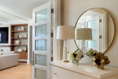
The tone is set from the entryway. The duo replaced the solid doors with five-panel frosted glass versions to allow light to flood in. Dawn laid the entry’s white oak flooring in a herringbone pattern to set the area apart from the rest of the home, lined the vestibule in grasscloth wallpaper for a rich effect and added furnishings with soft gold accents to enhance the laid-back elegance. “We tried to offer a yin and yang with textures—the nubby, textured wallpaper contrasts with the slick mirror; the earthier, warmer wood on the flooring is a counterpoint to the crystal chandelier,” Dawn says.
The tone-on-tone palette of neutrals continues throughout the home. Two living areas, the dining room and kitchen stretch beyond the vestibule, with quartzite, shellstone, walnut, glass and burnished brass creating a sophisticated but unfussy blend.
The ‘must’ for the great room was a giant sectional that could accommodate the family of five. “This is where everyone hangs out to watch TV or play games,” Dawn says. Low-slung side tables are integrated into the sectional, and a pair of ottomans have sliding tables on top to hold more food or drinks.
A feature wall, with a shellstone fireplace surround, holds the TV and walnut built-ins with a custom neutral-brown stain. “We worked really hard to get the red out with that finish,” Dawn says. The cabinetry is anchored with a Taj Mahal Quartzite, a nod to the Crystal Quartzite of the kitchen countertops. “It’s a nice way to bring in the elements of the island and offers a contrast to the wood,” she adds.
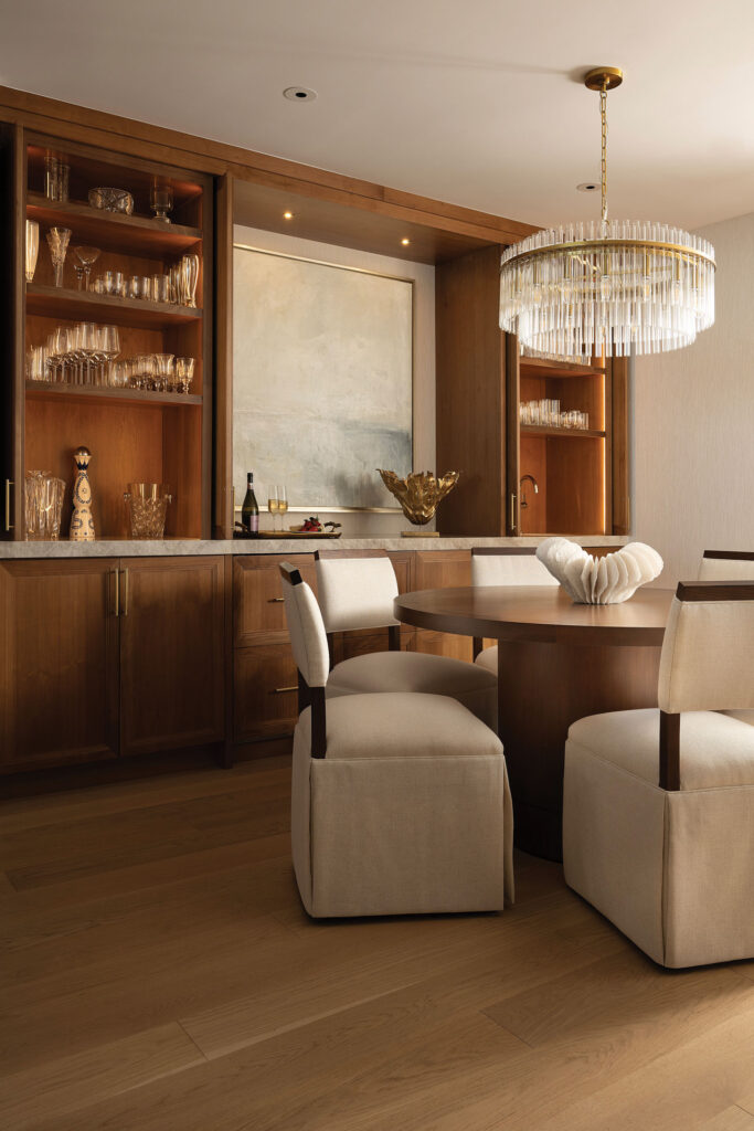
Warmly tinted walnut continues in the adjoining dining room’s built-in bar. “The bar is the highlight of the space,” says Dawn, noting that the doors can pocket back to display the content of the cabinets. Above the round table hangs a chandelier with clear extruded glass tubs and a burnished brass base.
On the other side of the room, the bright-white kitchen cabinets flaunt brass hardware, and the backsplash incorporates a wavy tile pattern—a nod to beachside living. The team added a second island to allow plenty of space for prep and entertaining. “One’s more a working island, the other is for gathering and eating,” Dawn says. The kitchen wall stretches down to a smaller family room that culminates in what the designer calls the “magic window.” “It has the prettiest view in the whole apartment,” she says. “That’s the artwork, the wow of the room.”
In every space—from the larger gathering areas to the more intimate bedrooms—the Little Palm team mixed textures. Textured chenille chairs, a wool rug, velvet pillows and fuzzy knit throws offer coziness without distracting from the view in the family area. In the primary bedroom, rod pocket drapes above floor-to-ceiling windows cover blinds and hardware, and a silk bedcover, faux fur throw and pale leather bench soften the stark white walls. “They make the room feel gentle, serene and quiet,” Dawn says. “After all, that’s why they come here.”
Builder: Signal House Builders
Interior Design: Little Palm Design Group
Photography: Diana Todorova

