When a husband and wife bought a 2015 home by one of the original Port Royal builders, A. Vernon Allen, they called on their Midwestern hometown designer, Carrie Long, to make over the interiors. Carrie could see the home’s bones were strong. The space already had gracefully vaulted ceilings, gentle archways and generous windows; it just needed to reflect the clients’ cleaner aesthetic. “It was more about stripping back to reveal the beautiful detailing,” the Michigan-based Carrie Long Interiors founder says. With a style that’s neither too modern nor too traditional and a willingness to experiment, the couple let the designer loose with her vision.
Carrie first removed existing wallpaper, window dressings and hardware, then painted the walls, ceilings and trim in soft shades of white and gray; she also redid some of the finishes on the flooring and ceiling. “We wanted to let the classic architecture shine,” she says. Carrie used the home’s lines as a starting point to furnish each space, working in rich wood tones and deep hues like navy, fuchsia and cognac to add depth and create a flow from one room to the next.
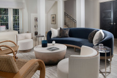
The formal living room is all about curves. Carrie repeated the rounded shape from the arched entryways in a navy A. Rudin sofa and pair of white side chairs, the arms of two vintage wicker chairs, and the two étagères near the fireplace.
The desk in a nearby nook—which Carrie designed to seat two people comfortably—is a curvy take on a Parsons desk.
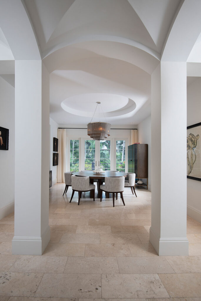
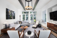
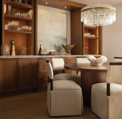
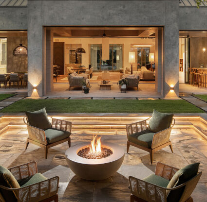
In the dining room, the theme continues with a circular coffered ceiling as the focal point, emphasized by a round table, round-backed chairs and a tiered chain-mail chandelier. Nearby, two dark wooden beams in the casual family room create a strong angle on the white-paneled ceiling and pick up the walnut tones in the furniture. Following the geometric lines, the furnishings are more angular, with a boxy L-shaped sofa, a square side table and side chairs with right-angle arms. A custom long, curved banquet and stone-topped table in the kitchen fit perfectly within an arched window opening. And on the lanai, the ample, squared-off seating echoes the patio and pool area openings.
With those nods to the homes’ geometry as a foundation, Carrie filled out the furnishings with an eye toward function and ease of care, as the couple has several pets and frequently hosts grandkids and houseguests. “Everything has to make sense; it has to be durable and look amazing,” Carrie says. “They want whoever is there to feel comfortable.” She used the colors of the furnishings to add depth and balance to the rooms. In the living room, the sofa and decorative accessories pick up the purples, blues and blacks in the color-inverted photograph of a daisy over the fireplace and a contemporary geometric painting in the alcove. In the dining room, Carrie used a gold-leaf triptych and fashion photographs within traditional frames to lend what could have been a sterile room a sense of history. In the kitchen, the gray upholstery of the banquette harkens to the perimeter countertops for a sense of symmetry throughout the room.
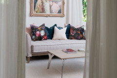
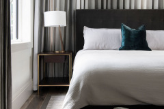
The final touch was finding statement art, lighting and accessories that spoke to the owners, who have diverse tastes. “The wife was like, ‘What can you dream up?’” Carrie recalls. The five-bedroom home includes two primary suites with their own bedrooms, sitting rooms and bathrooms—one’s designed with the wife in mind; the other for the husband’s taste. In the wife’s sitting room, Carrie used a Victorian era-inspired painting the wife owned as a starting point, riffing on the blush tones and floral themes within the frame with a panoply of pillows that pull in aubergines, ochres and rich reds. In the husband’s suite, the designer channeled five-star hotel design, decorating in tones of gray and draping the differently sized windows in floor-to-ceiling ombré curtains.
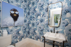
Carrie and the couple tinkered with other small visual moments, too: The designer suggested the bold Phillip Jeffries floral print wallpaper to create drama in the powder room. “I’m not a wallpaper person, but Carrie convinced me I should have it somewhere, and now I love it,” the wife says. The wall covering brightens the room, and the stylish subject in the print by Nigerian artist Adekunle Adeleke unites the gold and blue hues in the space.
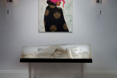
For the landing on the second floor, Carrie built a stand with integrated lighting to illuminate a statement piece—a sculpted female form encased in resin—creating a hybrid work of art and lamp. It’s paired with a painting the homeowner fell in love with on a trip to Puerto Rico. “At this point, I could just say, ‘Carrie, go and surprise me,’” the wife says. “I love watching her work.”
Interior Design: Carrie Long Interiors
Builder: A. Vernon Allen
Photography: Diana Todorova

